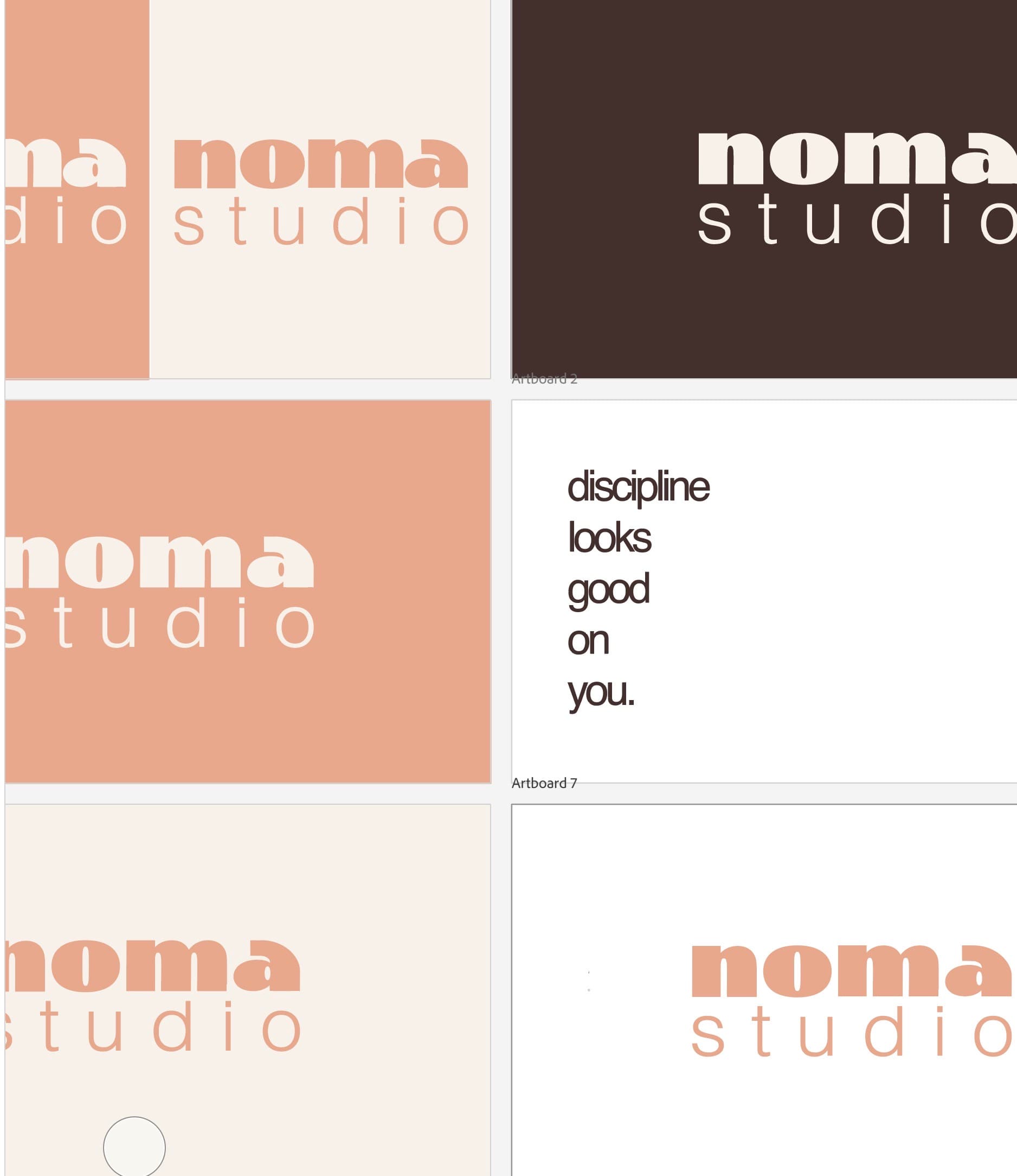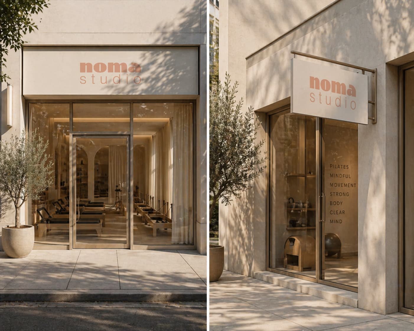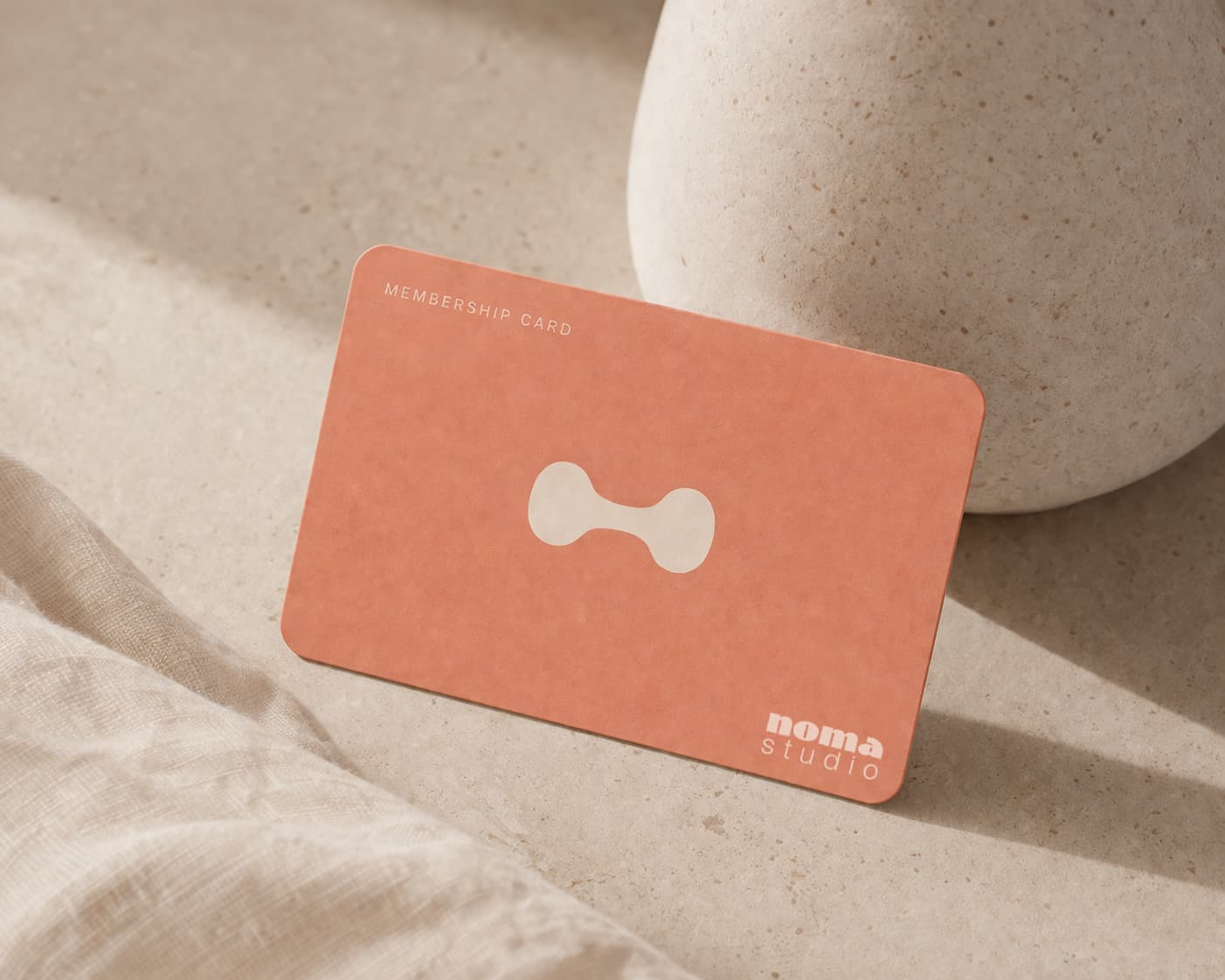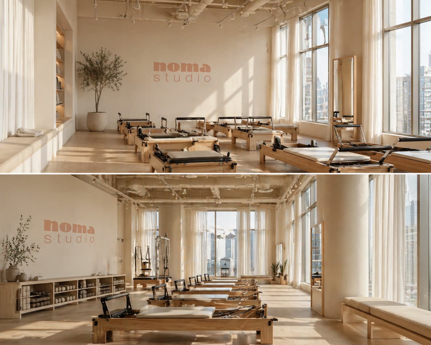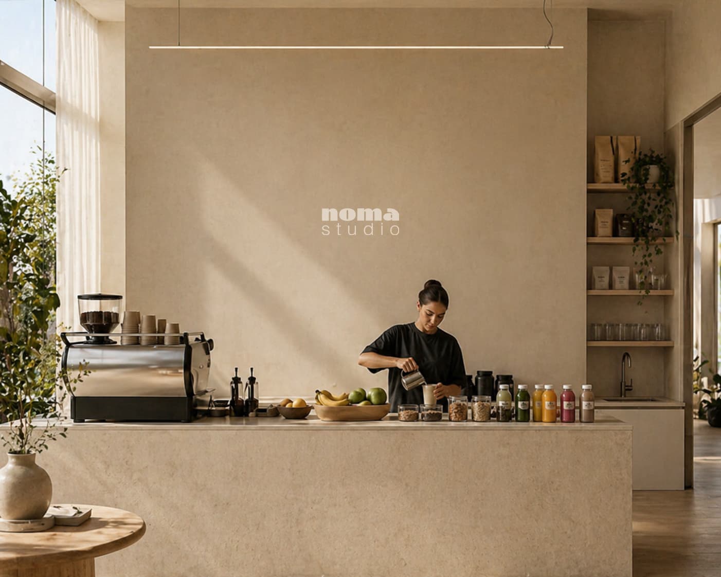
The central decision was restraint with warmth. The logo is lowercase not because it's soft, but because it's confident enough not to shout.
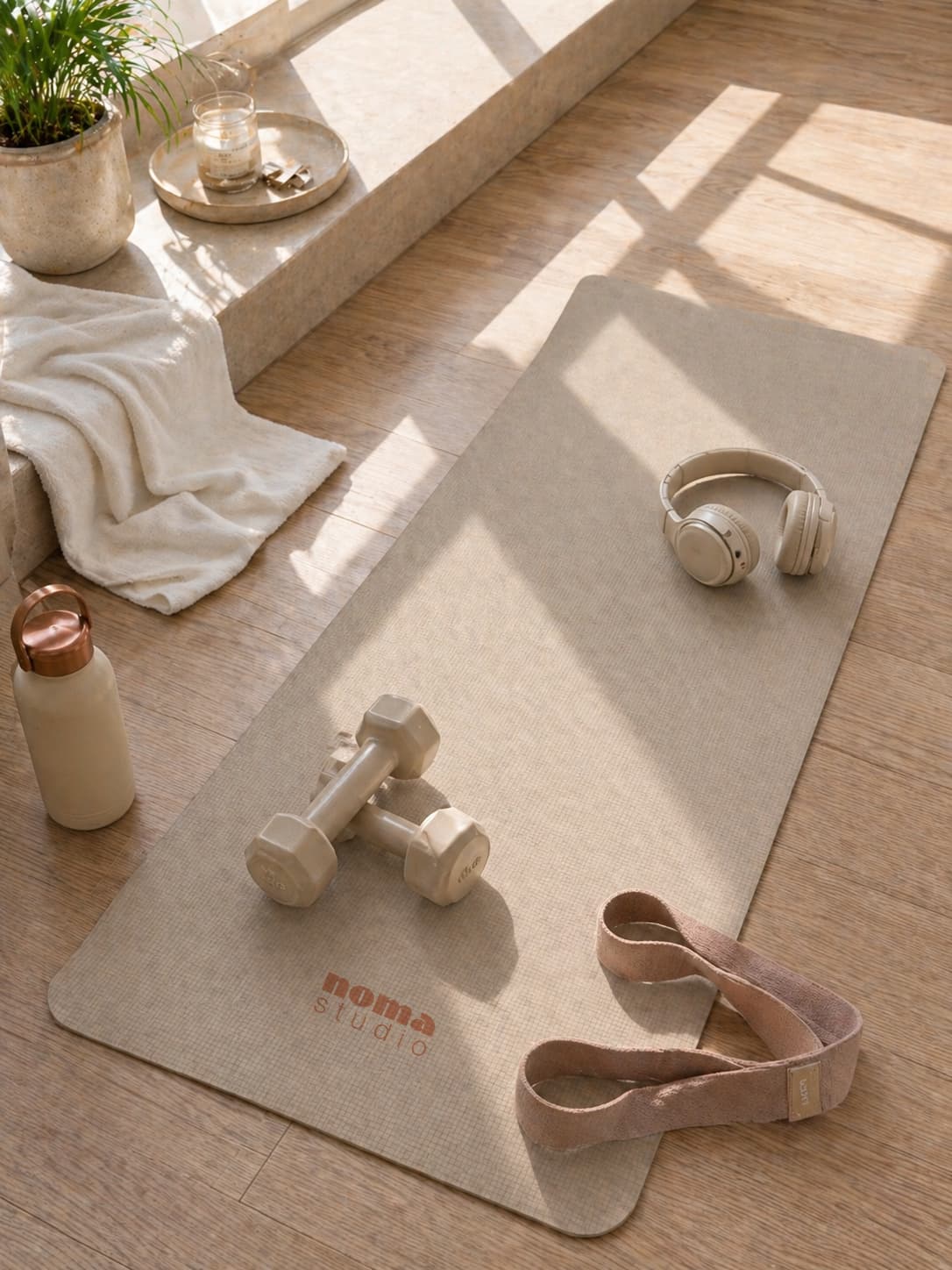
The terracotta tone was chosen deliberately to dodge the two traps of the category: the neons of performance fitness and the blush pinks of self-care. No illustration, no decoration — every choice made by subtraction.