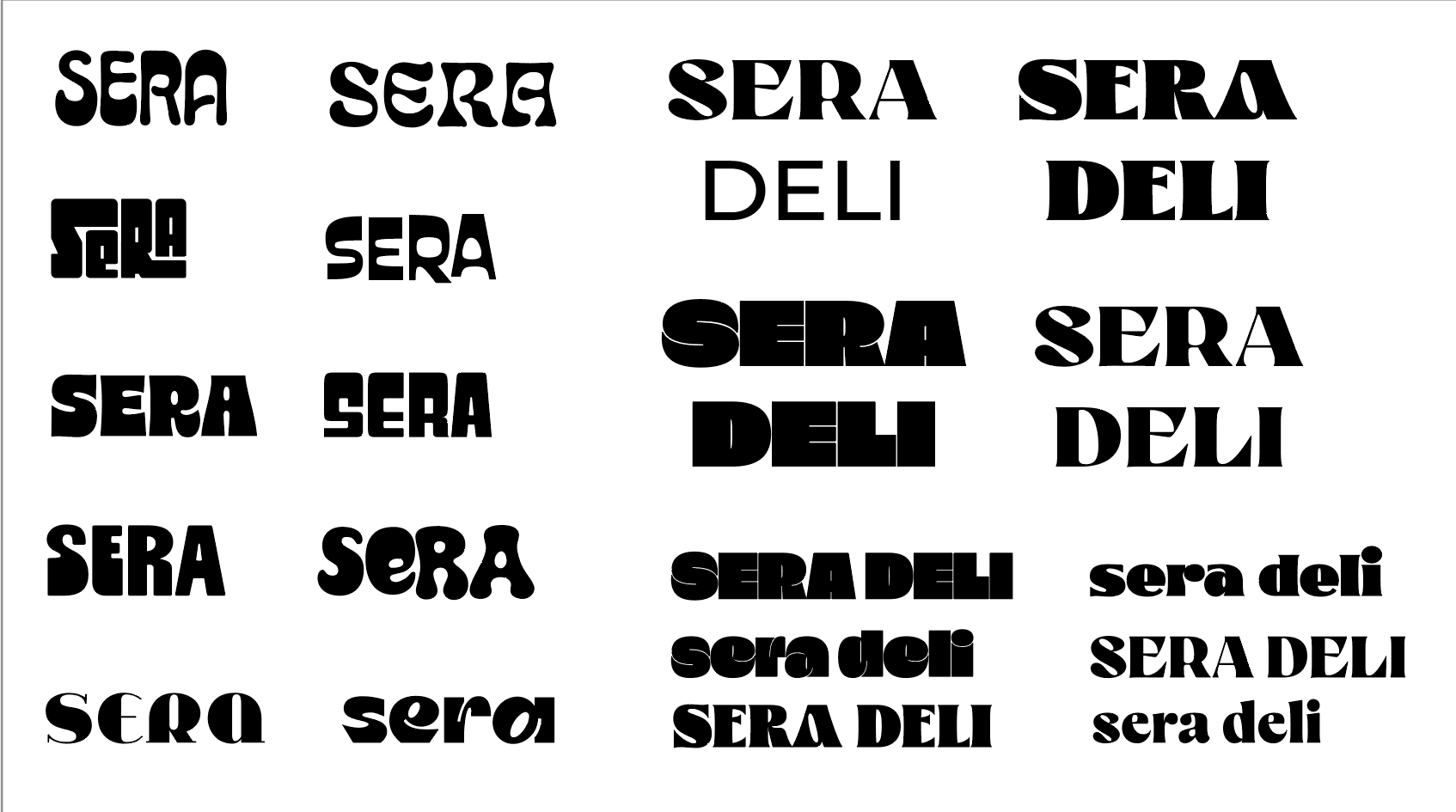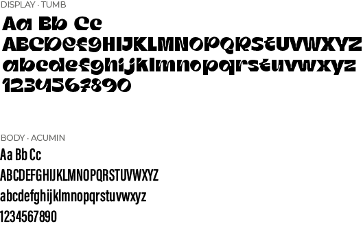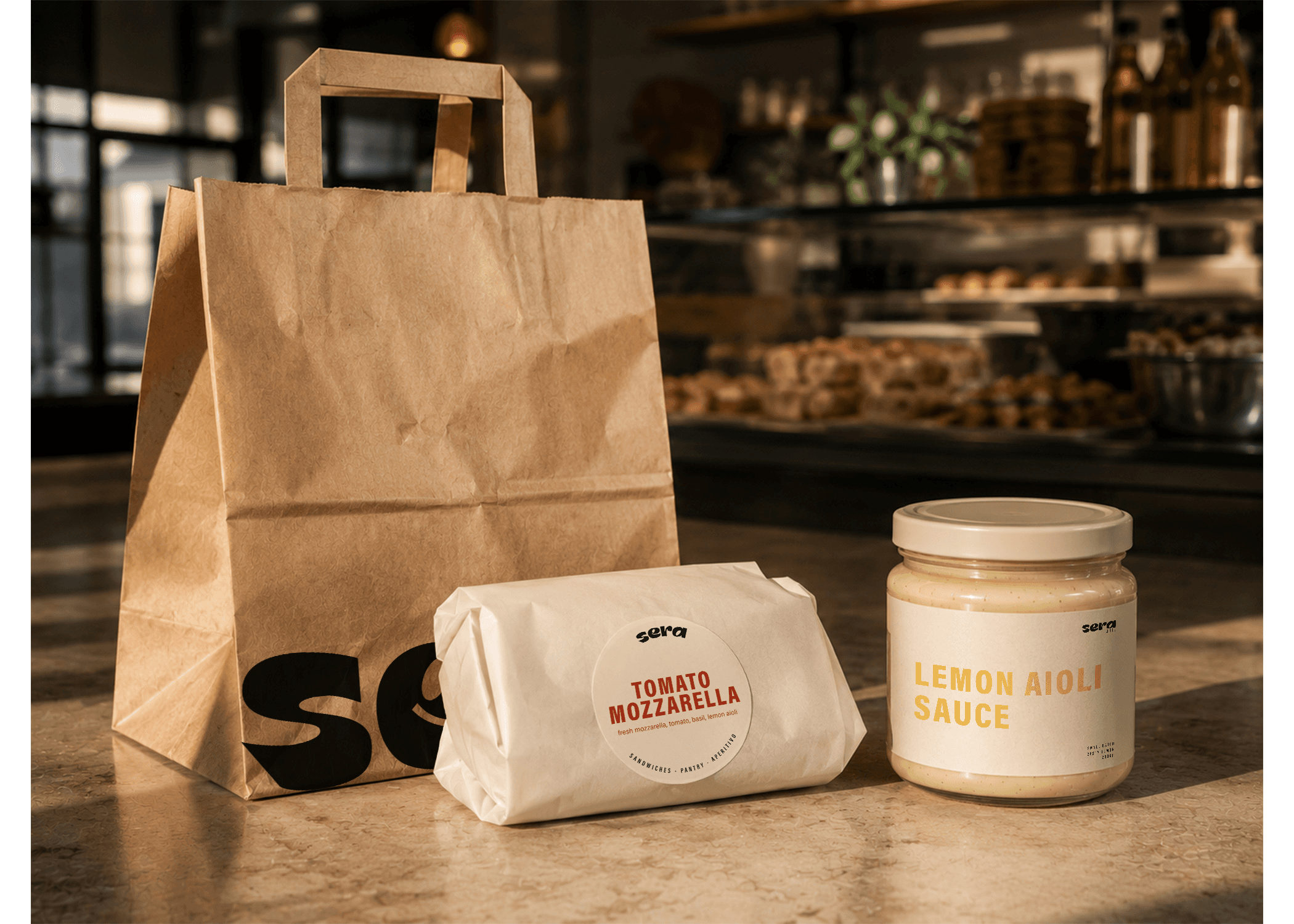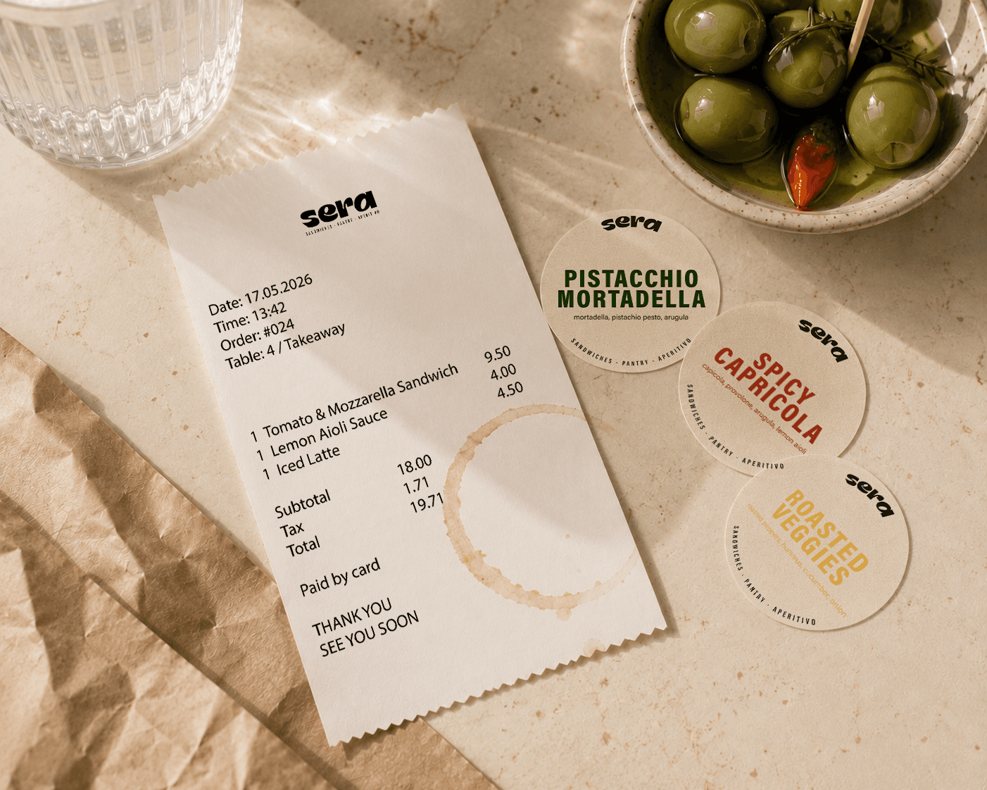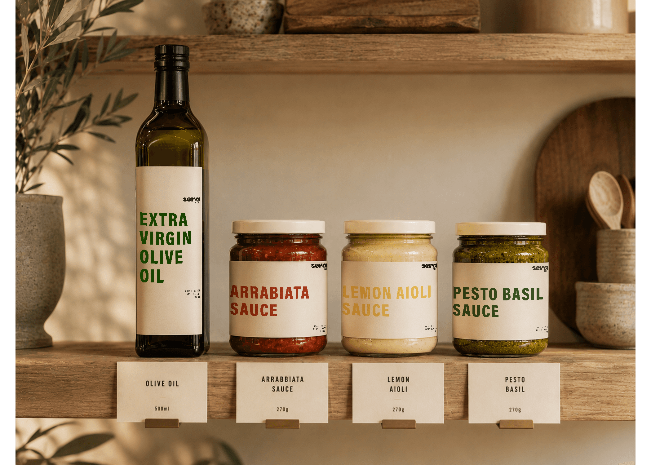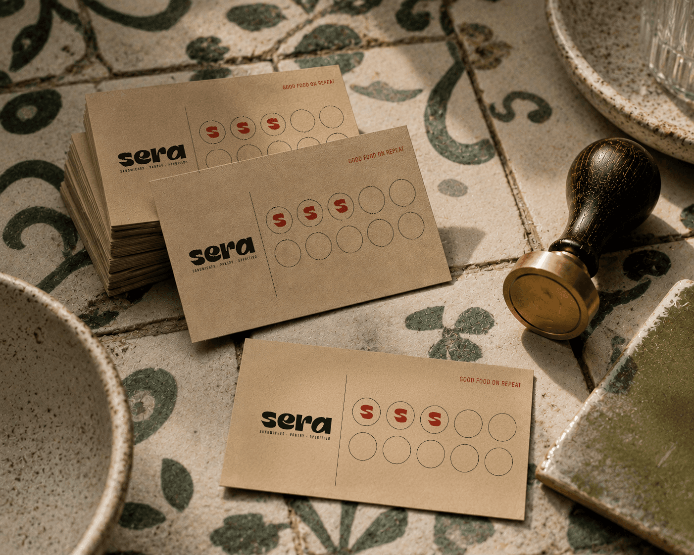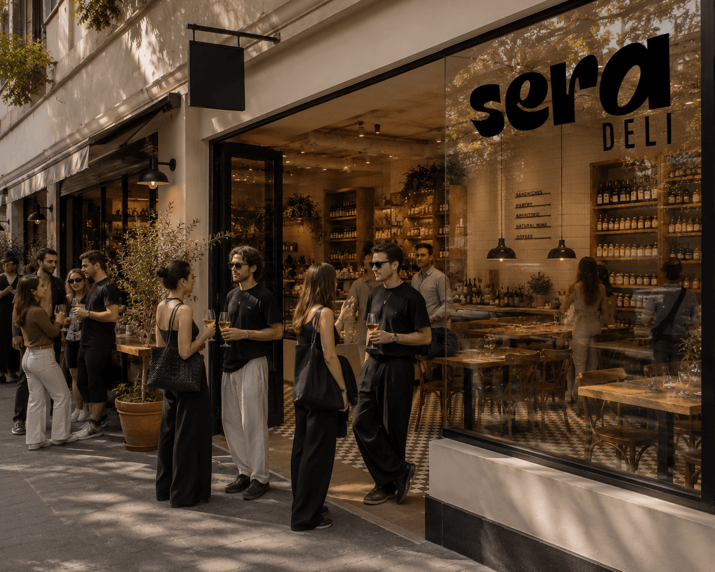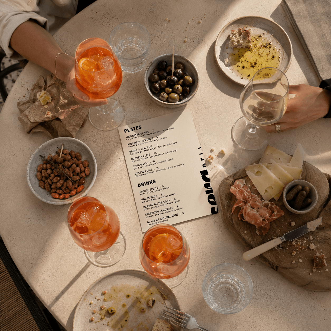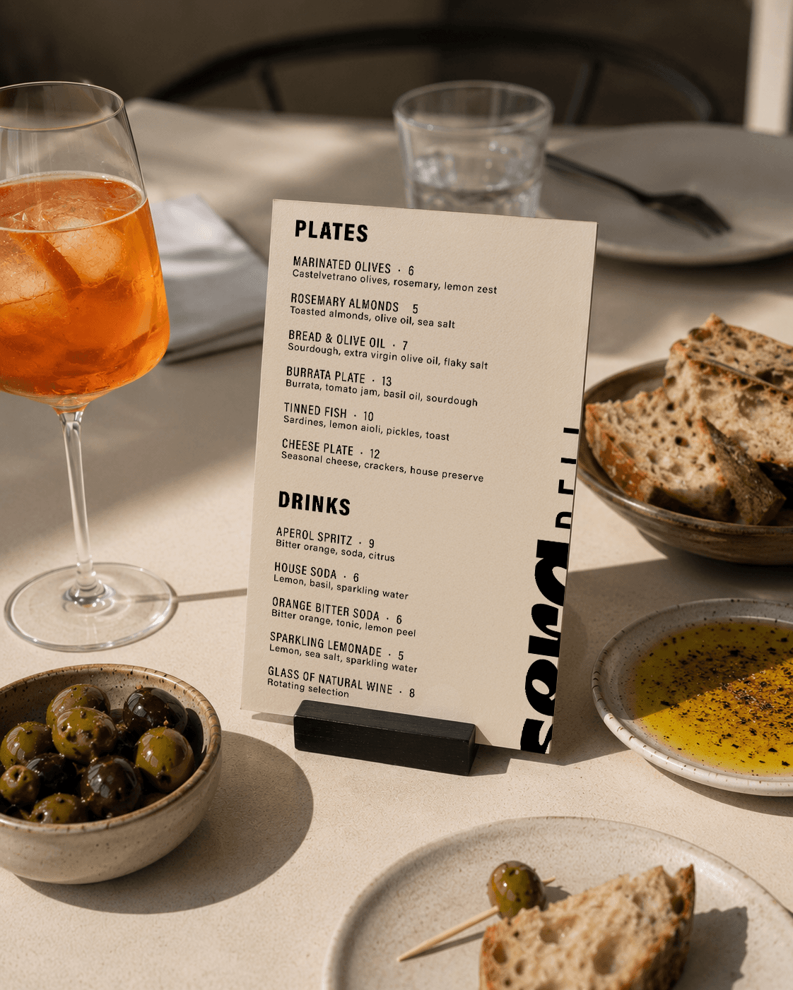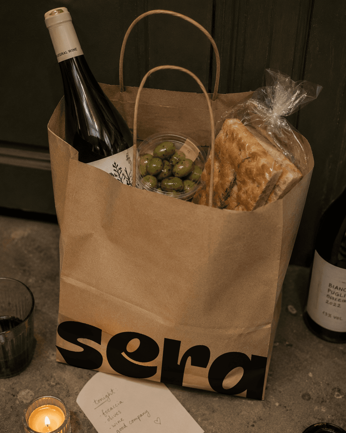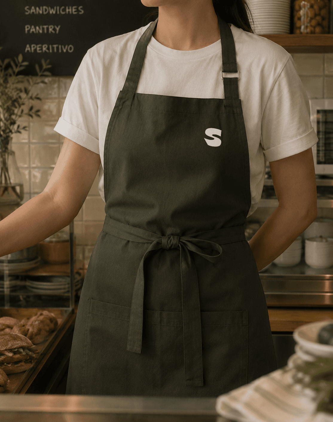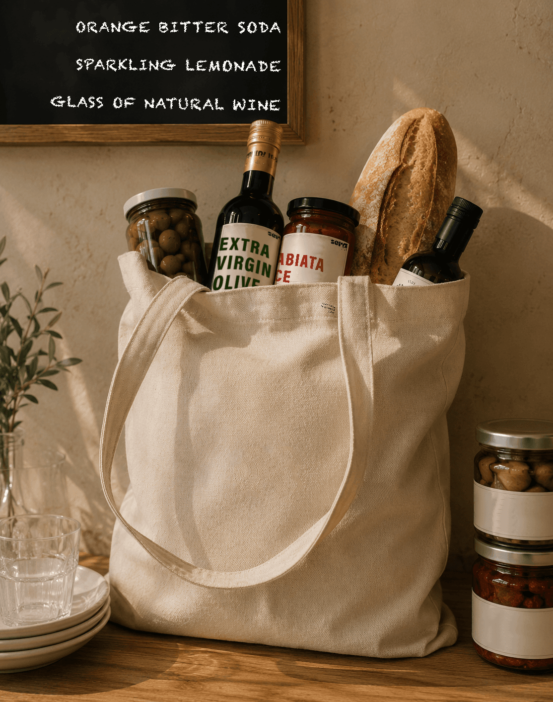
A warm, graphic identity built on bold typography, tactile paper textures and simple, food-led moments.
The system was designed as a flexible language — kraft, cream and bold product names — that holds together across takeaway bags, sandwich wraps, pantry jars and the aperitivo menu.